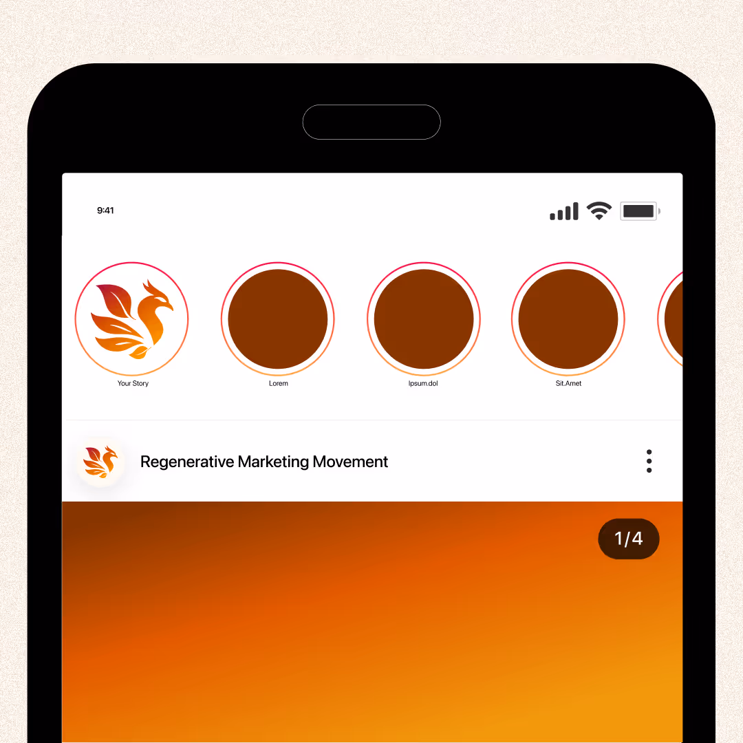
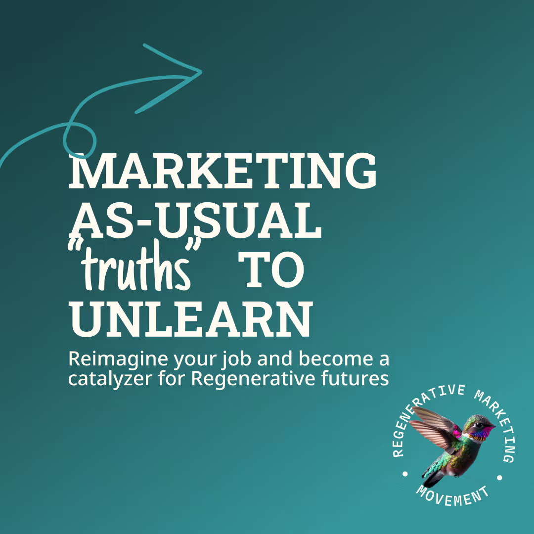
A visual guide for the Regenerative Marketing Movement. Bringing together marketeers to rethink marketing to let go of the stories, thoughts and assumptions that no longer serve life on earth and our businesses.
I was responsible for:
- Project management
- Logo Design
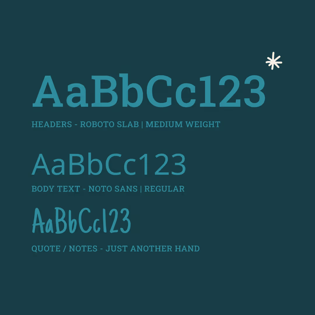
- Style guide Design
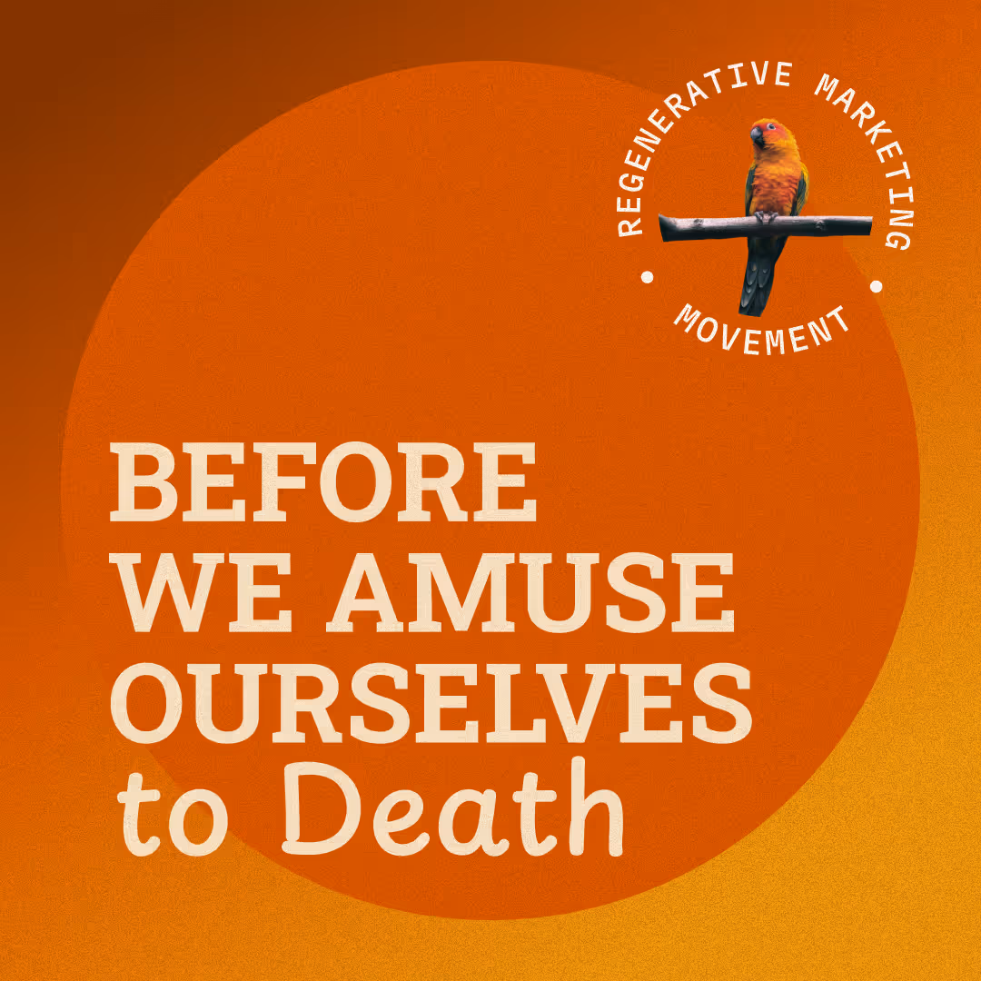
- Web design + multiple marketing materials
Visual Designer
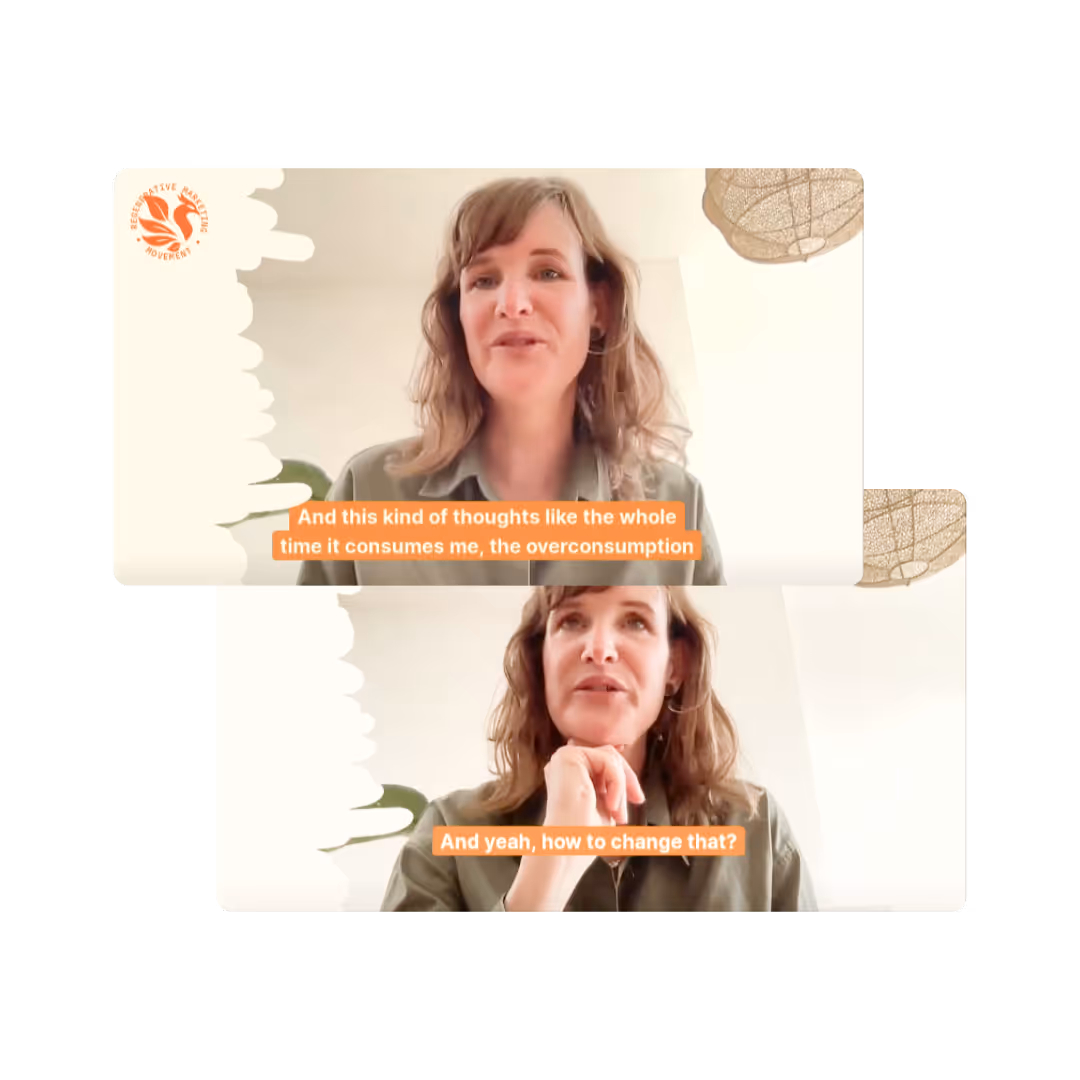
Learn more about the rebranding and my thoughts on the role of marketing & design to create positive change in.
"Marketeers + Designers don’t need to built a new skillset to change the world, we already have the number 1 skill: storytelling. We just need to tell the right story and promote the right products"
Learn more about how the logo came about.
Skip to the good part
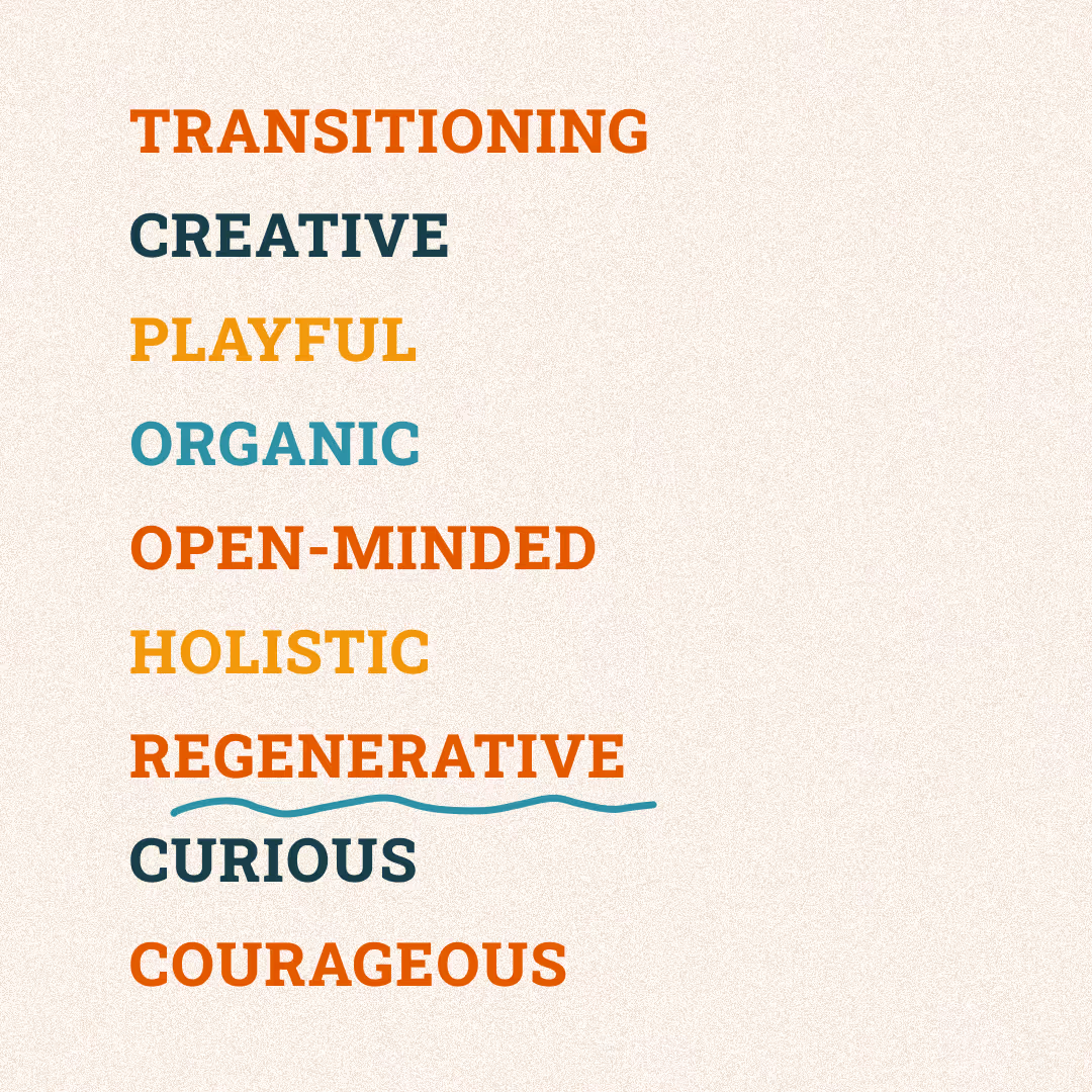
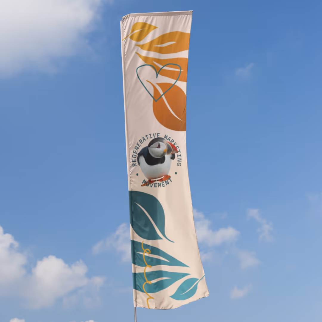
The rebrand aims to develop an identity that is inclusive and appeals to a wide range of creative professionals.
"We want to attract all creative and smart people to join the movement, not only the ones that already making a change."
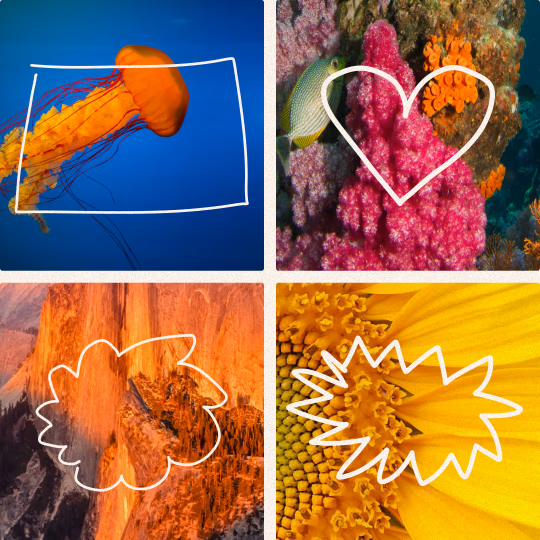
By using bright and diverse colors, the brand creates a sense of excitement and energy that attracts innovative thinkers.

Incorporating doodles and sketches, the new visual language reflects a continuous state of ideation and innovation.
The playful approach is a nod to the draft mode of creative processes, highlighting the movement's commitment to ongoing improvement and adaptability.
.gif)
Learn more about the process in creating the logo with AI, my sketchbook and my creative brain.

The Phoenix bird was a given for the logo design. The bird symbolizes the Marketing Movement and was inspired by a variation of the quote by Timothy Morton - All art is ecological
"We have been in the business of collapsing for far too long!It’s time to rise from the ashes!"
Image 1 - the logo inspiration provided in the brief
Image 2 - the illustration used in the marketing materials before the rebranding.
Asking DALL•E for inspiration.
PROMPTDesign a logo with a central swirling circle as the main shape, incorporating only the head of a stylized phoenix bird at the outer end
...integrates the letter 'R' with the head of a stylized phoenix
Tweaking the variation into a more minimalist style.
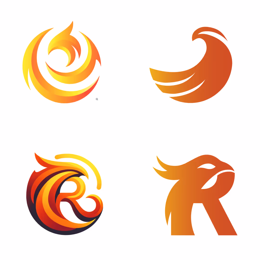
"The first logo reminds me too much of a aviator logo, the 2nd logo feels more like a sports team."
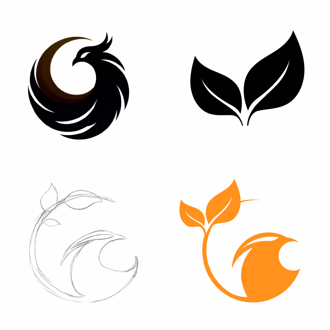
The logo was missing the regenerative aspect and therefor I wanted to add an element referring to nature.
Using my sketchbook to make a more minimalist version, making the bird look the other way/outwards and 'collage' the nature + bird elements together in a circular shape.
"This logo is the right direction but it's quiet masculine, can we make it more feminine?"
Using AI for inspiration to combine the elements.
PROMPTA vector logo design featuring a phoenix with wings that resemble leaves.
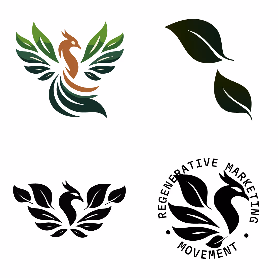
Adding more elegance/femininity to the logo by using by using more organic shapes. Special detail to change the eye shape to be more feminine.
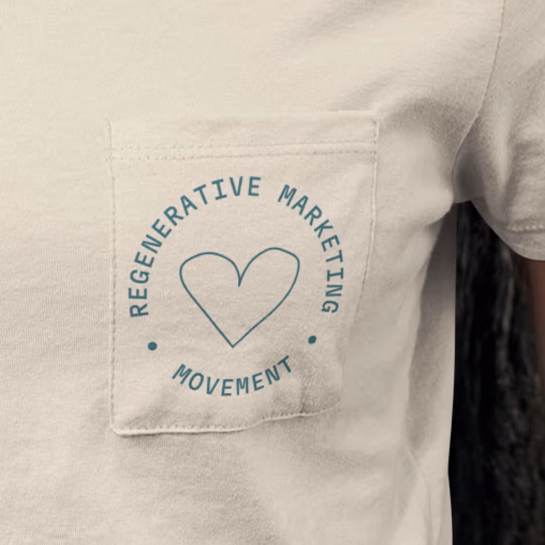
Simplifying the logo to an emblem/stamp style to represent the movement and integrating the long name.

Looking for a human that understands your customer, your team and your techstack?
Say hello and find out how we can collaborate now, or on future projects.
hello@fleuraugustinus.com